

Senior Thesis – TPA
January 5, 2013
At SIUC, all seniors graduating from the Communication Design program are required to complete a senior thesis project and display it in the senior exhibition show. This was both exciting and terrifying at the same time. So. Many. Eyes. There were only a few professors who took on senior thesis students, mine was Rob Lopez. Prof. Lopez gave us a few choices on which we could frame our projects. I chose the ‘dream project’ – a re-branding of professional tennis. This made sense for me, I am an avid follower of professional tennis and I have been playing the game competitively since I was 13. This being a creative exercise, I imagined a world where the two governing bodies of tennis, the ATP (Association of Tennis Professionals) for men and the WTA (Women’s Tennis Association) for women had merged into one unified body: the TPA (Tennis Professionals Association).
The Project
With a project in mind, I built myself a creative brief. The deliverables for the project were split into three parts:
- The Brand
- The Ad Campaign
- The Flash Site (cue sighs here – it WAS 2009…)
The Brand
A good brand starts with a good logo. I looked at the old ATP and WTA logos and compared them to other sports organizations logos. What I found was an emphasis on action – exciting shapes, bold sans-serif fonts and bright colors. I set out to develop a logo that matched that exciting flare, but that captured the heritage and class of the game of tennis. I ended up with a four-color tennis ball analog with an emphasis on forward motion (both of the ball and the organization).
The Ad Campaign
After branding came the next challenge: the ad campaign. The logo is new and exciting which is exactly what the game of tennis is. Technology and new levels of fitness have combined to make the game faster and more powerful than ever before. I wanted to bring the unbelievable talent of pro tennis players to the forefront, so I decided to focus on the things the players did that were unbelievable. This gave birth to the campaign’s hook: “Just Unbelievable”.
The Print Ads
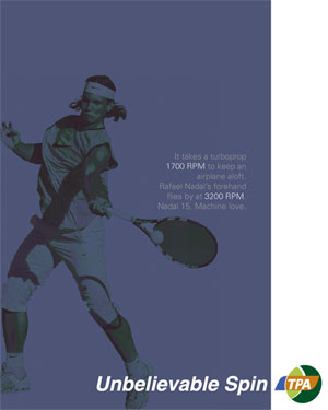
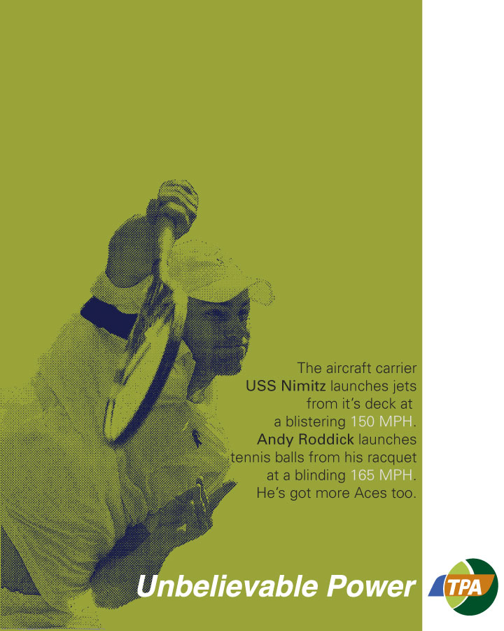
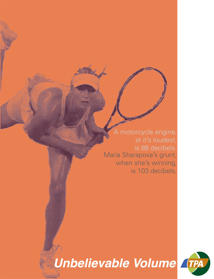
I created a series of four print ads that would spotlight players from the men’s and women’s side of the game. I chose the players because of the unbelievable things they could do – Andy Roddick’s lightning serve, Rafael Nadal’s ridiculous spin, Maria Sharapova’s supersonic shrieks and Roger Federer’s utter dominance. I assigned each player a color from the logo and built an ad for each. I used illustrations based on photographs to give each ad a more stylized and personalized feel. One of the most natural parts of creating the ads was the copy. I knew I wanted to focus on the unbelievable aspects of each players game, so I adjusted the hook to suit each player. The message needed to be short but sweet so each ad featured a comparison of the player’s ability versus a real world contraption – pitting man against technology seemed a fitting struggle. Matching that with witty anecdotes created copy that was short, simple but also razor sharp.

The Billboards
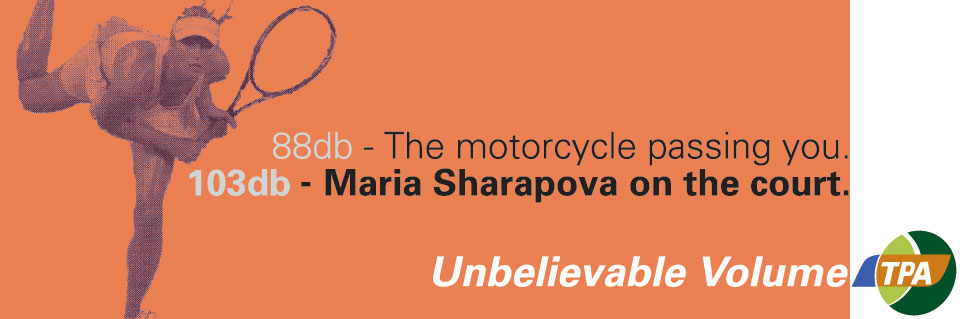
I took my two favorite print ads and built them into billboards. My experience with Weatherford Signs, who I was interning with and later worked full-time, proved invaluable here. Production for large format is very different. Your imagery must be sharp and your copy must be direct. Featuring the players and there message was paramount, but there could be no witty banter here. I decided that the best course was to feature the comparison between technology and player.

The Flash Site
Yes! Flash! Having not yet discovered HTML5 + CSS3, and knowing only rudimentary JavaScript, I decided Flash was the best way to produce an interactive user experience. I set about production of the site, with an emphasis on branding and featuring as much information about professional tennis as possible. The site has bios for top players from both the men and women’s side, explanation of some rules, and features up and coming players (from 2009). The site also featured an animated introduction with music that I produced. The site was a great learning experience for me and seeded my interest in user experience and interactive web design.
You can view the flash site here. It is a flash site, so it’s not-so mobile friendly.